

What is Device Pixel Ratio (DPR)? Why Images Look Blurry on Retina Displays
Why do crystal-clear images turn blurry on MacBooks, 4K monitors, and smartphones? Learn how Device Pixel Ratio works, how CSS pixels differ from physical pixels, and how to fix fuzzy graphics with srcset, SVG, and modern web techniques.
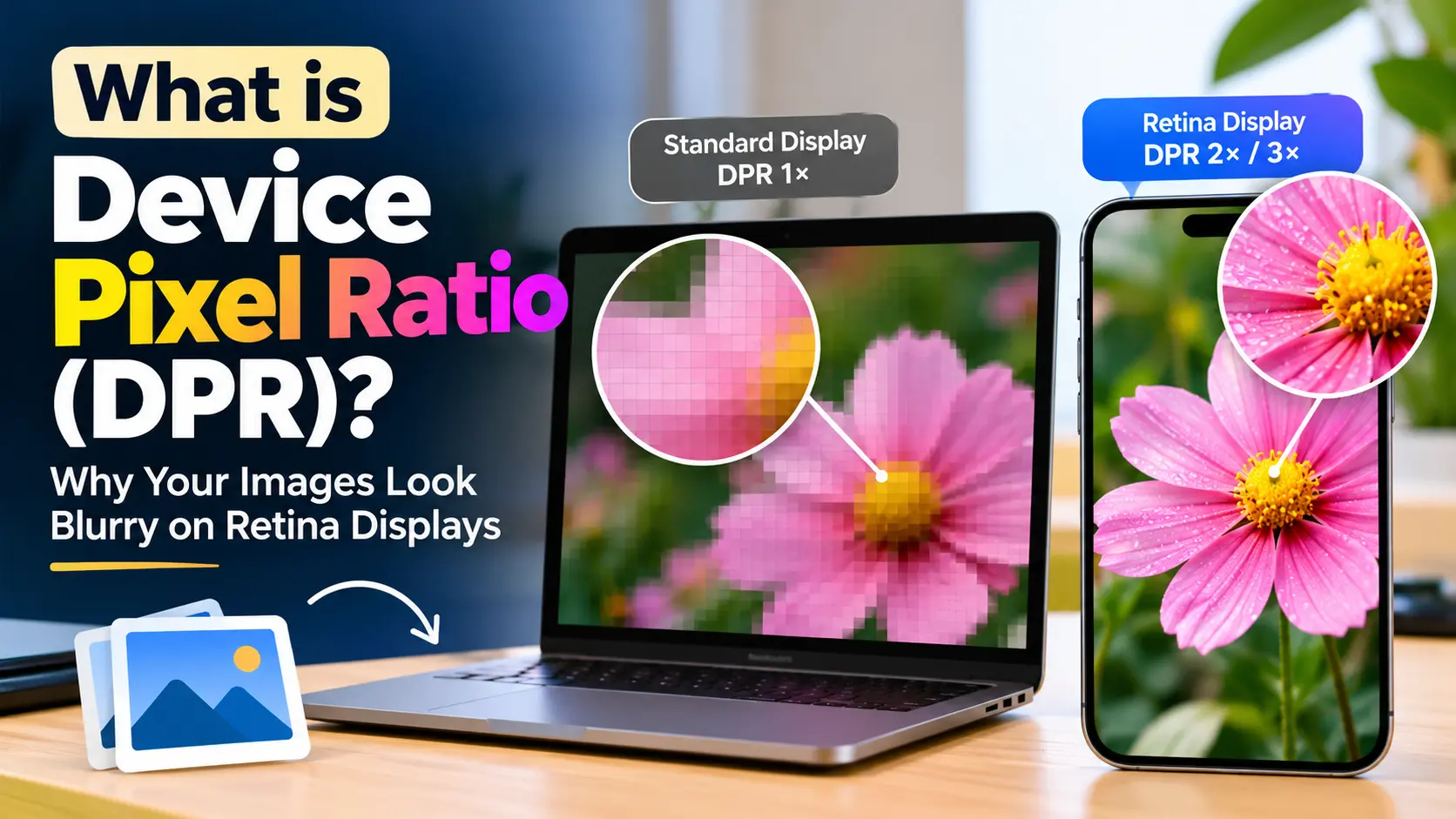
You spend days designing a website. You upload a sharp PNG logo, preview it on your desktop monitor, and everything looks crisp. Then you pull up the exact same webpage on an iPhone, a MacBook, or a 4K display—and your logo looks muddy, soft, and visibly blurry around the edges.
Meanwhile, text on the very same page looks razor-sharp. Headings look carved out of glass, yet photos, icons, and hero banners look like they were pulled from an old website built in 2005.
Why does an expensive high-resolution screen make graphics look worse instead of better?
The answer comes down to a single number: Device Pixel Ratio (DPR).
Understanding DPR is one of the most practical skills you can learn as a web designer, frontend developer, or site owner. Once you see how browsers handle high-density screens, you will never upload a blurry image or struggle with responsive asset delivery again.
The Core Problem: Hardware Pixels vs. Layout Pixels
To understand DPR, we have to look back at how computer monitors used to work.
For decades, digital screens were simple: one pixel in your code matched one physical diode on the monitor.
If your monitor had a native resolution of 1024 × 768, it contained 1,024 microscopic RGB light emitters horizontally and 768 vertically. If you wrote a line of CSS saying width: 200px;, your browser told the monitor to light up exactly 200 hardware dots across the glass.
Back then, displays had a density of roughly 72 to 96 pixels per inch (PPI). A 100-pixel button looked about the same physical size across almost every office monitor on Earth.
The Smartphone Revolution Broke This Rule
Everything changed in 2010 when high-density displays (such as Apple’s first “Retina Display” on the iPhone 4) hit the consumer market.
Hardware makers squeezed four times as many pixels into the exact same physical glass. An iPhone screen that used to hold 320 × 480 pixels suddenly packed 640 × 960 physical pixels into a tiny 3.5-inch pocket screen.
That jump created an immediate crisis for the web.
If browsers had continued treating one CSS pixel as one physical pixel:
- A regular website built for desktop (960px wide) would have shrunk down to the size of a postage stamp.
- Navigation links and buttons would have been only 2 or 3 millimeters wide—impossible to tap with a human finger.
- Body text would have required a magnifying glass to read.
Browsers could not afford to break every website on the internet. To solve this, browser engineers and web standards groups split the concept of a “pixel” into two completely separate things:
- Physical Pixels (Hardware Pixels): The actual, microscopic dots of light physically built into the display panel.
- CSS Pixels (Logical Pixels / Reference Pixels): An abstract unit used by web browsers for layouts, typography, spacing, and media queries.
Device Pixel Ratio (DPR) is simply the conversion rate between these two worlds.
What Exactly is Device Pixel Ratio (DPR)?
Device Pixel Ratio (DPR) is the ratio between physical hardware pixels and logical CSS pixels on a given display.
$$\text{DPR} = \frac{\text{Physical Hardware Pixels}}{\text{CSS Logical Pixels}}$$
You can also think of DPR as answering this basic question:
“How many physical hardware dots does this screen use to draw a single 1px box from my CSS stylesheet?”
Here is how common screen types translate that formula:
1. Standard Displays (DPR = 1.0)
- What it means: 1 CSS pixel = 1 Physical hardware pixel.
- Where you find it: Older 1080p desktop monitors (24-inch or 27-inch), budget office laptops, older TVs.
- How it renders: A 100 × 100 pixel image occupies exactly 100 × 100 hardware diodes on the screen. There is no scaling, no interpolation, and no stretching.
2. High-DPI / Retina Displays (DPR = 2.0)
- What it means: 1 CSS pixel = 2 Physical pixels along each axis.
- Where you find it: MacBook Air, MacBook Pro, iPad, 4K monitors set to 200% scaling, many Android tablets.
- How it renders: Because pixels are counted in two dimensions (width and height), a $1 \times 1$ CSS pixel area is backed by a $2 \times 2$ grid—meaning 4 physical pixels are used to draw a single logical layout unit!
3. Ultra High-Density Mobile Screens (DPR = 3.0)
- What it means: 1 CSS pixel = 3 Physical pixels along each axis.
- Where you find it: iPhone 13 Pro through iPhone 16 Pro, Samsung Galaxy S series, Google Pixel flagship phones.
- How it renders: A $1 \times 1$ CSS pixel area is backed by a $3 \times 3$ grid of hardware diodes. That means 9 physical hardware dots light up for every single CSS pixel!
DPR Cheat Sheet: Popular Devices
| Device | Physical Screen Resolution | CSS Viewport Size | Device Pixel Ratio (DPR) | Physical Dots per CSS Pixel |
|---|---|---|---|---|
| Standard 24” Office Monitor | 1920 × 1080 | 1920 × 1080 | 1.0x | 1 dot ($1 \times 1$) |
| MacBook Air 13” (M2/M3) | 2560 × 1664 | 1280 × 832 | 2.0x | 4 dots ($2 \times 2$) |
| MacBook Pro 16” (M3 Max) | 3456 × 2234 | 1728 × 1117 | 2.0x | 4 dots ($2 \times 2$) |
| 27” 4K Monitor (at 200% scaling) | 3840 × 2160 | 1920 × 1080 | 2.0x | 4 dots ($2 \times 2$) |
| 14” Windows Laptop (at 150% scaling) | 1920 × 1080 | 1280 × 720 | 1.5x | 2.25 dots |
| iPhone 15 / 16 (Base) | 2556 × 1179 | 393 × 852 | 3.0x | 9 dots ($3 \times 3$) |
| Samsung Galaxy S24 Ultra | 3120 × 1440 | 384 × 832 | 3.0x | 9 dots ($3 \times 3$) |
| iPad Air 11” | 2360 × 1640 | 1180 × 820 | 2.0x | 4 dots ($2 \times 2$) |
Notice anything interesting about Windows laptops?
Notice the 1.5x DPR on the Windows laptop. While Apple sticks strictly to clean integer scales (like 2.0x and 3.0x), Windows display settings allow fractional scaling (125%, 150%, 175%). That means DPR can be a floating-point number like1.25or1.5!
Why Do Images Look Blurry on High-DPR Displays?
Now that you understand that an iPhone or MacBook uses 4 to 9 hardware dots for every single CSS layout pixel, the cause of blurry graphics becomes obvious.
Let us walk through a concrete example step by step:
Imagine you have a client logo. In your CSS stylesheet, you give the logo a neat layout size:
.site-logo {
  width: 200px;
  height: 60px;
}
To fill this space, you export a PNG file named logo.png measuring exactly 200 × 60 pixels, and place it on your page:
<img src="logo.png" class="site-logo" alt="Acme Corp">Here is what happens behind the scenes depending on what monitor your visitor is using:
Scenario A: Your Visitor Is on a 1080p Office Monitor (DPR = 1)
- The browser reserves a space of 200 × 60 CSS pixels on the screen.
- The screen has 1 hardware dot per CSS pixel.
- Total hardware area: $200 \times 60 = 12,000$ hardware diodes.
- Your image file provides: $200 \times 60 = 12,000$ image pixels.
- Result: Perfect 1-to-1 match. Every pixel in the image file lands squarely on one hardware pixel. The logo looks completely clean.
Scenario B: Your Visitor Is on a MacBook Pro or 4K Monitor (DPR = 2)
- The browser still reserves a layout box of 200 × 60 CSS pixels so your site layout doesn’t break.
- BUT the screen has a DPR of 2.0. That layout box now spans 400 × 120 physical hardware pixels!
- Total hardware area: $400 \times 120 = 48,000$ hardware diodes.
- Your image file still only has: $200 \times 60 = 12,000$ pixels.
- The browser is suddenly missing 36,000 pixels of visual data!
- Result: The browser has no choice but to stretch your image to twice its original size. It uses bilinear or bicubic interpolation to guess what color the missing pixels should be. The edges blur, crisp lines turn soft, and the logo looks out of focus.
Scenario C: Your Visitor Is on an iPhone 16 Pro (DPR = 3)
- The 200 × 60 CSS box now covers 600 × 180 physical pixels ($108,000$ hardware diodes).
- Your 12,000-pixel image is stretched to 9 times its original pixel area!
- Result: Severe blur, pixelation, and fuzzy text.
Why Text Doesn’t Suffer From This Problem
You might wonder: If images get stretched, why does HTML text stay sharp?
Text does not use bitmap pixels. Fonts are vector outlines mathematically described by curves and coordinates (Bézier curves).
When a browser renders a paragraph of text on a 2x or 3x screen, the operating system re-renders the font geometry directly at the display’s native physical resolution. It calculates the razor-sharp curves using all 48,000 or 108,000 hardware pixels available.
That is why blurry raster images look especially jarring on high-DPI screens—they sit side-by-side with impeccably sharp vector typography!
How to Check Your Current DPR in Any Browser
You don’t need fancy tools or browser extensions to check the Device Pixel Ratio of the screen you are reading this on right now.
Method 1: Using the Browser Console
- Open your browser’s developer tools (press
F12on Windows/Linux, orCmd + Option + Ion Mac). - Click on the Console tab.
- Type:
window.devicePixelRatio - Press
Enter.
The number returned is your screen’s exact active DPR. On a standard monitor, it will return 1. On a Retina MacBook, it will return 2. On an iPhone, it will return 3.
Method 2: Listen for DPR Changes in JavaScript
Did you know that DPR can change dynamically on the fly?
If a user zooms in with their browser (Cmd + or Ctrl +), moves a window from a laptop screen to an external 1080p monitor, or toggles display scaling in Windows settings, the browser’s DPR updates instantly.
You can monitor DPR changes using modern JavaScript with matchMedia:
const updateDprNotice = () => {
  console.log(`Current DPR is now: ${window.devicePixelRatio}`);
};

// Create a media query matching the current resolution
const dprQuery = window.matchMedia(`(resolution: ${window.devicePixelRatio}dppx)`);

// Listen for resolution changes (e.g., zoom or monitor move)
dprQuery.addEventListener("change", updateDprNotice);
How to Fix Blurry Images: 5 Proven Strategies
Now for the practical part. How do we ensure our graphics and photos look crystal-clear on every screen, without sending massive, slow-loading files to older monitors?
Here are the 5 standard techniques used in modern web development:
1. Use SVG for Logos, Icons, and Simple Graphics
Whenever an image consists of shapes, flat colors, or logos, never export it as PNG or JPEG. Use SVG (Scalable Vector Graphics) instead.
Like fonts, SVGs are vector files made of XML coordinates rather than raster grids. Whether viewed on a 1x monitor, a 3x iPhone, or a billboard printed at 16K, SVG renders at the display’s maximum physical resolution with mathematically perfect crispness.
<!-- Sharp on every display in existence, tiny file size -->
<img src="/logo.svg" width="200" height="60" alt="Company Logo">
Rule of thumb:
- Logos, icons, UI badges, arrows, and vector illustrations $\rightarrow$ SVG.
- Photography, realistic screenshots, and complex artwork $\rightarrow$ Raster with responsive srcset (see below).
2. The 2x Rule for Raster Images (Quick Fix)
If you have a raster image (like an avatar photo or an author headshot) that will always display at a fixed CSS size—say, 80px × 80px:
- Export the image file at double the resolution:
160px × 160px. - Save it in a modern format like WebP or AVIF to keep the file size tiny.
- Explicitly constrain the dimensions in your HTML or CSS to the target display size:
<!-- Physical file is 160x160, but constrained to 80x80 CSS pixels -->
<img src="/avatar@2x.webp" width="80" height="80" alt="Profile Picture">
On a 1x monitor, the browser downsamples the image slightly, keeping it clean. On a 2x Retina screen, every hardware diode receives native visual information, leaving the photo pin-sharp.
3. Use srcset with Pixel Density Descriptors (1x, 2x)
What if you don’t want to force visitors on slow mobile networks or standard 1x displays to download double-sized image files?
HTML provides native support for DPR-based image switching using the srcset attribute with density descriptors (1x, 2x, 3x):
<img
  src="/hero-800.webp"
  srcset="/hero-800.webp 1x,
          /hero-1600.webp 2x,
          /hero-2400.webp 3x"
  width="800"
  height="450"
  alt="Modern workspace setup"
  loading="lazy">
How the Browser Evaluates This:
- A user on a standard 1080p office PC (DPR 1.0) downloads
hero-800.webp(~45 KB). - A user on a MacBook Pro (DPR 2.0) downloads
hero-1600.webp(~120 KB). - A user on an iPhone 16 Pro (DPR 3.0) downloads
hero-2400.webp(~220 KB).
Each device gets the exact density it can physically display, preserving both bandwidth and crispness automatically.
4. Fluid Responsive Images with srcset and sizes (For Dynamic Layouts)
On responsive websites, images rarely stay at a fixed width. A card image might take up 100% of the screen on mobile, but only 33% of the screen inside a 3-column grid on desktop.
When image width changes depending on the screen size, density descriptors (1x, 2x) are not enough. Instead, use width descriptors (w) paired with the sizes attribute:
<img
  src="/article-cover-800.webp"
  srcset="/article-cover-400.webp 400w,
          /article-cover-800.webp 800w,
          /article-cover-1200.webp 1200w,
          /article-cover-1600.webp 1600w"
  sizes="(max-width: 640px) 100vw,
         (max-width: 1024px) 50vw,
         33vw"
  width="800"
  height="450"
  alt="Understanding screen resolution"
  loading="lazy">
Why This Works Like Magic:
The browser multiplies the rendered CSS slot size by the screen’s Device Pixel Ratio:
- A mobile phone has a viewport of 390px (at DPR 3.0). The image takes
100vw($390\text{px}$). The browser calculates: $$390\text{px} \times 3.0 = 1,170\text{ physical pixels needed}$$ It selectsarticle-cover-1200.webp. - A 1080p desktop user has a 1280px browser window (at DPR 1.0). The image takes
33vw($422\text{px}$). The browser calculates: $$422\text{px} \times 1.0 = 422\text{ physical pixels needed}$$ It selectsarticle-cover-400.webp.
No JavaScript required. The browser makes the optimal calculation before a single pixel is painted.
5. High-DPI CSS Backgrounds with image-set() or Media Queries
If you set background images in your CSS stylesheet, standard media queries or the modern image-set() function allow you to serve high-density assets effortlessly.
Option A: Modern image-set() (Recommended)
Supported across all modern browsers (Chrome, Safari, Firefox, Edge):
.hero-banner {
  background-image: image-set(
    url("/hero-bg.webp") 1x,
    url("/hero-bg@2x.webp") 2x
  );
  background-size: cover;
  background-position: center;
}
Option B: CSS Media Queries with min-resolution
If you need granular control over breakpoints and density at the same time:
/* Standard 1x background */
.card-header {
  background-image: url("/card-bg.webp");
  background-size: 300px 180px;
}

/* 2x Retina background */
@media (-webkit-min-device-pixel-ratio: 2), (min-resolution: 192dpi) {
  .card-header {
    background-image: url("/card-bg@2x.webp");
  }
}
Why
192dpi?
Standard CSS baseline resolution is defined as 96 dots per inch (DPI). Double that for a 2x screen, and you get $96 \times 2 = 192\text{dpi}$ (or2dppx, which stands for dots per pixel unit).
The Hidden Trap: Canvas and WebGL on High-DPI Screens
If you work with the HTML5 <canvas> element (for charts, interactive graphics, games, or signature pads), you will encounter the DPR blur problem in an even more aggressive form.
By default, an HTML canvas creates a drawing buffer based solely on its HTML attributes:
<!-- Default canvas: Creates a 300x150 drawing buffer -->
<canvas id="chart"></canvas>
If you style this canvas with CSS to match your layout:
#chart {
  width: 300px;
  height: 150px;
}
On a MacBook or 4K monitor, your text and lines inside the canvas will appear shockingly fuzzy.
Why? Because the canvas created a bitmap buffer of only 300 × 150 pixels, and the browser stretched that tiny bitmap over a 600 × 300 physical hardware area!
The Proper Way to Sharpen HTML Canvas for Retina Displays:
To fix this, you must scale the canvas’s internal drawing buffer by window.devicePixelRatio while keeping its CSS display size locked in place:
const canvas = document.getElementById("chart");
const ctx = canvas.getContext("2d");

// Desired layout size in CSS pixels
const cssWidth = 300;
const cssHeight = 150;

// Get current display density
const dpr = window.devicePixelRatio || 1;

// 1. Set the physical buffer size multiplied by DPR
canvas.width = cssWidth * dpr;
canvas.height = cssHeight * dpr;

// 2. Lock the visual size on the page using CSS pixels
canvas.style.width = `${cssWidth}px`;
canvas.style.height = `${cssHeight}px`;

// 3. Scale all drawing operations so coordinates remain in CSS units
ctx.scale(dpr, dpr);

// Now draw your shapes as normal — they will render razor-sharp!
ctx.fillStyle = "#2563eb";
ctx.fillRect(20, 20, 100, 50);
This simple snippet guarantees that chart libraries, game engines, and vector drawing apps render with pixel-perfect clarity on Retina displays.
Performance vs. Crispness: Finding the Sweet Spot
Now that you know how to serve 2x and 3x images, an important question arises: Should you serve 3x images to every modern smartphone?
In almost all cases, the answer is no.
Here is why:
-
Diminishing Returns for Human Eyes:
On a modern smartphone held at normal viewing distance (10 to 12 inches), human vision cannot distinguish individual pixels once density exceeds roughly 300 to 350 PPI. A 2x image on a 3x smartphone screen looks indistinguishable from a true 3x image to 99% of users. -
File Size Explosions:
Pixel area scales quadratically:- A 1x image has 1x data.
- A 2x image has 4x data ($2 \times 2$).
- A 3x image has 9x data ($3 \times 3$)!
Serving true 3x images for large photographs can turn a reasonable 120 KB WebP image into a massive 800 KB file. That burns mobile data plans, degrades Core Web Vitals (specifically Largest Contentful Paint / LCP), and slows down your page load times.
The Recommended Practice for 2026:
- Vector UI (Logos & Icons): Always use SVG. Zero blur, microscopic file size.
- Standard Photos & Hero Banners: Cap your responsive srcset at 2.0x. Serving 2x images to 3x phones provides 95% of the visual sharpness while saving up to 60% in bandwidth!
- Modern Compression: Always encode your high-resolution images using WebP or AVIF. Because high-DPI screens pack pixels so tightly, you can safely apply slightly stronger compression (quality setting around 75–80) without visible degradation.
Frequently Asked Questions
What is the difference between PPI, DPI, and DPR?
- PPI (Pixels Per Inch): The physical hardware density—how many actual light emitters fit into one physical inch of the glass panel.
- DPI (Dots Per Inch): Originally a printing term describing how many ink dots a printer sprays per inch. In web development, it is often used synonymously with PPI.
- DPR (Device Pixel Ratio): A software multiplier used by browsers and operating systems to translate logical layout units (CSS pixels) into physical hardware pixels.
Why does my 4K monitor report a resolution of 1920 × 1080?
If you have a 4K display (3840 × 2160) and Windows or macOS has your display scaling set to 200%, your operating system tells web browsers that your desktop width is 1920 × 1080 logical pixels, with a Device Pixel Ratio of 2.0.
Your monitor is still displaying a genuine 4K image! The operating system is simply using groups of 4 physical pixels ($2 \times 2$) to render each logical desktop pixel so text and windows aren’t impossibly tiny to read.
Can DPR be a decimal number like 1.25 or 1.5?
Yes. On Windows and ChromeOS devices, users can set custom scaling percentages like 125%, 150%, or 175%. When a user sets display scaling to 150%, the browser’s window.devicePixelRatio becomes 1.5.
Does zooming in with the browser change the DPR?
Yes! When you press Ctrl + or Cmd + to zoom in on a webpage, modern browsers do not stretch the page like a magnifying glass. Instead, they increase window.devicePixelRatio, which re-calculates the layout and prompts responsive srcset attributes to fetch sharper image assets.
Key Takeaways
- Two Types of Pixels Exist: Physical pixels are the hardware diodes on the screen; CSS pixels are the layout building blocks used by browsers.
- DPR is the Conversion Factor: DPR tells you how many physical dots are used to draw a single CSS pixel.
- The Reason for Blur: When an image only provides 1 image pixel for an area backed by 4 or 9 physical dots, the browser has to stretch it, creating blur.
- Use SVG First: Any shape, icon, or logo that can be vector should be SVG.
- Target 2x for Photos: For raster photography, serving 2x assets via
srcsetprovides retina sharpness without bloating page weight.
Want to check what your own device is reporting right now? Head back to our homepage tool at WhatIsMyScreenResolutions.com to see your live viewport, screen resolution, and Device Pixel Ratio measured instantly.
Pixel-accurate · measured on your device
What is my screen resolution?
Get your exact screen resolution, viewport, pixel density, and refresh rate — measured locally, updated live.
Run the test →Related Guides & Articles
Screen Resolution vs PPI (Pixels Per Inch): What Actually Determines Display Sharpness?
Why does a 4K TV look less sharp up close than a 1080p phone? We explain the math of PPI, angular resolution, viewing distance, and subpixel matrices.
Refresh Rate (Hz) vs Screen Resolution: Why 144Hz 1440p Beats 60Hz 4K for Most People
Confused between 4K 60Hz and 1440p 144Hz? We break down the physics of refresh rate vs resolution, motion clarity, cable bandwidth, and GPU demands.