

Viewport vs. Screen Resolution: What’s the Difference?
Why does your 4K screen show 1920x1080 online? Discover the real difference between viewport and screen resolution, CSS pixels, Device Pixel Ratio (DPR), and display scaling.
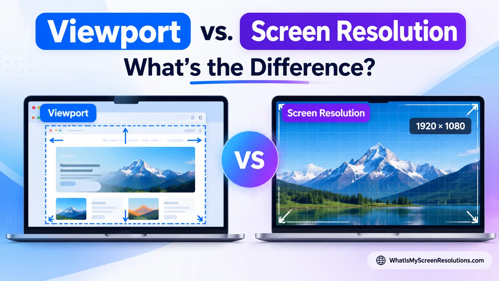
Have you ever purchased a laptop or external monitor advertised with a glorious 4K Ultra HD (3840 × 2160) display, only to visit an online screen tester or web development tool and see it report your display as 1920 × 1080?
Or perhaps you own a smartphone with a manufacturer-specified physical resolution of 2556 × 1179, yet when you browse the web, websites treat your screen width as a humble 393 pixels?
You haven’t been scammed by hardware manufacturers, and your browser isn’t broken. What you are witnessing is the fundamental distinction that powers the modern web: Screen Resolution vs. Viewport Size.
In this comprehensive guide, we will unpack everything you need to know about screen resolution, viewports, CSS pixels, Device Pixel Ratio (DPR), operating system scaling, and responsive design best practices in plain English.
Quick Summary: Viewport vs. Screen Resolution at a Glance
If you only have thirty seconds, here is the quick breakdown:
| Metric | Plain-English Definition | What Measures It? | Typical Example (16” Pro Laptop) |
|---|---|---|---|
| Physical Screen Resolution | The exact count of microscopic light-emitting hardware dots (pixels) built into the glass panel. | Hardware spec sheet, display box | 3456 × 2234 physical pixels |
| Display Scaled Resolution | The virtual desktop workspace resolution configured in OS display settings for comfortable reading. | OS Display Settings | 1728 × 1117 points (at 200% / @2x scaling) |
| Browser Screen Resolution | The total dimension of the device’s display as reported to web browsers in logical layout units. | Web browser detection | 1728 × 1117 logical pixels |
| Viewport Size | The active viewing area inside the browser window where web content is rendered (excluding tabs, toolbars, and taskbars). | Resized browser window | 1280 × 800 logical pixels |
| Device Pixel Ratio (DPR) | The ratio of physical screen dots used to draw one logical layout unit (Physical Pixels divided by Logical Pixels). | Display density measurement | 2.0 (or 3.0 on flagship smartphones) |
1. What is Screen Resolution?
Physical Pixels: The Hardware Grid
At its core, screen resolution refers to the physical grid of microscopic dots—called pixels (short for picture elements)—that make up your display monitor, television, phone, or tablet.
Every physical pixel on an LCD, OLED, or Mini-LED panel consists of three smaller subpixels: Red, Green, and Blue (RGB). By varying the electrical brightness powering these tiny diodes, your screen produces millions of distinct colors.
Manufacturers describe this hardware grid using horizontal and vertical pixel counts:
- Full HD (1080p): 1920 × 1080 pixels (about 2.07 million individual dots)
- QHD / 2K (1440p): 2560 × 1440 pixels (about 3.69 million dots)
- 4K Ultra HD: 3840 × 2160 pixels (about 8.29 million dots)
- 5K Retina: 5120 × 2880 pixels (about 14.75 million dots)
- 8K Ultra HD: 7680 × 4320 pixels (about 33.18 million dots)
Physical resolution is fixed in hardware. Unless you physically take a saw to the glass panel, the number of hardware diodes built into your screen never changes.
The Problem of Pixel Density (PPI)
In the early days of personal computing, monitors had a pixel density of roughly 72 to 96 Pixels Per Inch (PPI). On a traditional desktop monitor, each pixel on the screen was roughly the size of a tiny pinhead.
Back then, computers followed a simple 1:1 rule: 1 software pixel equaled exactly 1 physical hardware pixel. If an image was 200 pixels wide, it physically covered 200 light dots across your monitor screen.
Everything changed with modern smartphones and high-density laptop displays. Today’s devices pack 300 to 460+ pixels into a single inch of glass.
Consider what would happen if the old 1:1 rule were still used today:
- A standard website navigation button designed to be 40 pixels tall on a regular desktop monitor measures about 10.5 mm tall—perfect for a mouse click or a finger tap.
- On a 460 PPI modern smartphone screen, that same 40-pixel button would shrink down to 2.2 mm tall.
- Standard paragraph text would look like a tiny hairline crack, requiring a magnifying glass to read.
- Links and buttons would become virtually impossible to touch without accidentally clicking surrounding elements.
To prevent high-resolution screens from making websites impossibly small to read, operating systems and web standards introduced logical pixels and decoupled hardware dots from on-screen layout dimensions.
2. What is a Viewport?
The Viewport Explained
The viewport is the rectangular visible area inside your browser window where web content is rendered.
It represents the active canvas on which web pages live. Everything you see—text, background images, cards, interactive buttons—lives inside the viewport.
Crucially, the viewport excludes the browser’s own toolbars and operating system chrome:
- Browser tab bars and title bars
- URL search and address bar
- Bookmarks bar
- Developer inspection panels (when docked)
- The operating system taskbar, dock, or menu bar
When you resize your browser window on a desktop by dragging its corner, your physical monitor resolution remains constant, but your viewport size changes dynamically with every millimeter you drag.
Desktop vs. Mobile Viewports
On a desktop computer, understanding the viewport is simple: it is just the inner dimensions of your browser window. If you maximize the browser, the viewport takes up almost the entire screen (minus the tab bar and taskbar). If you snap two browser windows side-by-side, each viewport takes up roughly half the screen.
On mobile devices, things work a little differently:
- The Layout Canvas: Mobile browsers automatically adapt the page to fit the device’s width so you don’t have to scroll horizontally.
- Pinch-to-Zoom (Visual Viewport): When you pinch-to-zoom into a photo or diagram, the page layout stays locked in place so text doesn’t jumble up, while the visible window (the visual viewport) magnifies the specific area you zoomed into.
- Collapsing Address Bars: As you scroll down an article on mobile Safari or Chrome, the address bar slides away to give you extra vertical reading space, dynamically expanding the height of the viewport.
3. The Missing Link: CSS Pixels and Device Pixel Ratio (DPR)
To bridge the gap between microscopic hardware dots and comfortable reading sizes, the web uses CSS Pixels (also called logical pixels) and a multiplier called the Device Pixel Ratio (DPR).
How Device Pixel Ratio Works
The formula connecting physical screen resolution to your browser viewport is simple:
- Device Pixel Ratio (DPR) = Physical Pixels ÷ Logical Pixels
- Logical Viewport Pixels = Physical Pixels ÷ DPR
When DPR is 1.0, one logical pixel matches one hardware pixel. But on modern high-resolution displays, DPR is usually 2.0, 2.5, or 3.0.
For example, when DPR is 2.0:
- The browser lays out text, boxes, and buttons using a virtual grid that is half the physical resolution.
- Under the hood, the screen uses 4 physical pixels (a 2 × 2 grid) to draw each logical pixel unit.
- Text stays comfortably large, but curves, fonts, and photos look crisp and sharp instead of pixelated.
4. Real-World Examples: Why Numbers Differ Across Devices
Here is how physical resolution and viewport sizes translate across popular everyday hardware:
The 4K Desktop Monitor (Windows at 200% Scaling)
- Physical Hardware Resolution: 3840 × 2160 pixels
- OS Display Scaling: 200% (DPR = 2.0)
- Reported Browser Resolution: 1920 × 1080 logical pixels
- Why this happens: At 100% scale, text on a 4K desktop monitor would be microscopic. Windows doubles the UI size (200% scaling), so your browser reports a clean 1920 × 1080 workspace. Yet every font and graphic is rendered with all 8.3 million hardware dots, providing razor-sharp clarity.
Modern Pro Smartphones (iPhone & Android Flagships)
- Physical Hardware Resolution: Approximately 2556 × 1179 pixels
- Device Pixel Ratio: 3.0 (Super Retina / 3x density)
- Reported Viewport Width: Approximately 393 pixels
- Why this happens: When websites check screen size, they target the 393-pixel width. If web pages tried to display 1179 columns of content across a 6-inch phone screen, the layout would be unreadable without constant zooming.
Standard Office Monitor (24-inch 1080p)
- Physical Hardware Resolution: 1920 × 1080 pixels
- OS Display Scaling: 100% (DPR = 1.0)
- Reported Viewport: Up to 1920 × 1080 logical pixels (when maximized)
- Why this happens: On standard-density displays, 1 logical pixel equals exactly 1 physical hardware pixel.
5. OS Display Scaling vs. Browser Zoom
Both display scaling and browser zoom change how much content fits onto your screen, but they work at different levels:
Operating System Scaling
- Found in Windows (Settings > System > Display > Scale) or macOS (System Settings > Displays).
- Adjusts the overall scaling for the entire operating system, including desktop icons, system menus, file explorer windows, and application interfaces.
- Laptops with high-resolution screens typically ship from the factory with scaling set to 125%, 150%, or 200% by default.
Browser Zoom (Ctrl / Cmd + and -)
- Only affects the content inside that specific browser tab.
- When you zoom into a webpage at 150% or 200%, the browser increases its internal pixel multiplier.
- As a result, the effective viewport width shrinks. A browser window that had 1200 logical pixels of width at 100% zoom becomes 600 logical pixels wide at 200% zoom.
- If a website is responsive, zooming in will automatically shift from the multi-column desktop layout to a clean, readable mobile view. This is an intentional accessibility feature designed to help people read web content comfortably without needing to scroll side-to-side.
6. How Responsive Web Design Uses Viewports
A common question is: Why don’t websites design layouts for specific monitor sizes like 1080p, 1440p, or 4K?
Designing for specific hardware resolutions doesn’t work for three reasons:
- Window Resizing: Desktop users frequently multitask by resizing browser windows or docking windows side-by-side. An ultrawide monitor running at 3440 × 1440 resolution might have a browser window resized to only 1100 pixels wide.
- Device Diversity: There are thousands of phone, tablet, laptop, and foldable screen models on the market today.
- Different Scaling Levels: Two identical 15-inch laptops running 1080p screens will report different viewport sizes if one user prefers 100% scale and another prefers 125% scale.
Instead, modern web design uses fluid responsive layouts. Web designers set flexible breakpoints:
- Mobile Viewports (Under 640px): Single-column layouts, hamburger menus, full-width touch buttons.
- Tablet / Small Laptop Viewports (640px to 1024px): Two-column layouts, compact navigation bars.
- Desktop Viewports (Over 1024px): Multi-column grids, expanded sidebar menus, high-resolution media galleries.
By basing layouts on the active browser viewport rather than the physical monitor, websites look great whether you are viewing them on an iPhone, a tablet, or a 49-inch ultrawide desktop monitor.
7. Frequently Asked Questions (FAQ)
Why does an online screen test show 1920 × 1080 when my screen is 4K?
Your operating system has display scaling enabled (usually set to 200% for 4K displays). The browser reports screen dimensions in logical pixels rather than raw hardware dots so that buttons and text stay large enough to read easily.
What is the difference between window size and viewport size?
- Window Size: The entire outer application window, including the browser’s tabs, top title bar, address bar, bookmarks, and window borders.
- Viewport Size: Strictly the inner webpage area where website content is visible.
What is the viewport size of an iPhone?
While modern iPhones have physical screen resolutions between 2532 × 1170 and 2868 × 1320 pixels, their viewport sizes in browser logical pixels are:
- Standard Models (iPhone 13, 14, 15, 16): 390 × 844 or 393 × 852 pixels
- Pro Max & Plus Models: 430 × 932 or 440 × 956 pixels
- Compact / SE Models: 375 × 667 pixels
Can the viewport ever be larger than the screen resolution?
Yes. If you use multiple monitors arranged side-by-side and stretch a browser window across both screens, your browser viewport can be wider than any single monitor’s resolution.
How can I check my current viewport and screen resolution?
You can check your exact screen resolution, viewport dimensions, Device Pixel Ratio, and color depth in real time using our free detection tool right on the homepage at WhatIsMyScreenResolutions.com.
Key Takeaways
- Screen Resolution is physical hardware: it counts the millions of microscopic light diodes built into your display panel.
- Viewport Size is software layout: it measures the active viewing area inside your browser window.
- Logical Pixels ensure websites stay readable and touch-friendly on modern high-density screens.
- Device Pixel Ratio (DPR) is the bridge connecting physical hardware dots to on-screen layout dimensions.
- Websites adapt to viewports, not hardware: Responsive web design ensures pages look great regardless of display density or window size.
Pixel-accurate · measured on your device
What is my screen resolution?
Get your exact screen resolution, viewport, pixel density, and refresh rate — measured locally, updated live.
Run the test →Related Guides & Articles
Screen Resolution vs PPI (Pixels Per Inch): What Actually Determines Display Sharpness?
Why does a 4K TV look less sharp up close than a 1080p phone? We explain the math of PPI, angular resolution, viewing distance, and subpixel matrices.
Refresh Rate (Hz) vs Screen Resolution: Why 144Hz 1440p Beats 60Hz 4K for Most People
Confused between 4K 60Hz and 1440p 144Hz? We break down the physics of refresh rate vs resolution, motion clarity, cable bandwidth, and GPU demands.